
Social Distancing Dashboard provides roadmap for city dwellers
As countries take their first tentative steps towards loosening COVID-19 lockdown, society faces the difficult task of maintaining social distancing rules in practice. With growing numbers of pedestrians and cyclists returning to city streets, keeping a safe distance of 1.5m can be a challenge in many urban areas due to the way public space (or lack of it) has been designed. The Social Distancing Dashboard, a project led by scientists from Delft University of Technology (TU Delft), in collaboration with the Amsterdam Institute for Advanced Metropolitan Solutions (AMS Institute), helps to raise awareness about constraints posed by the design of public space and contributes to decision making for COVID-19 related interventions in urban planning.
Putting social distancing on the map
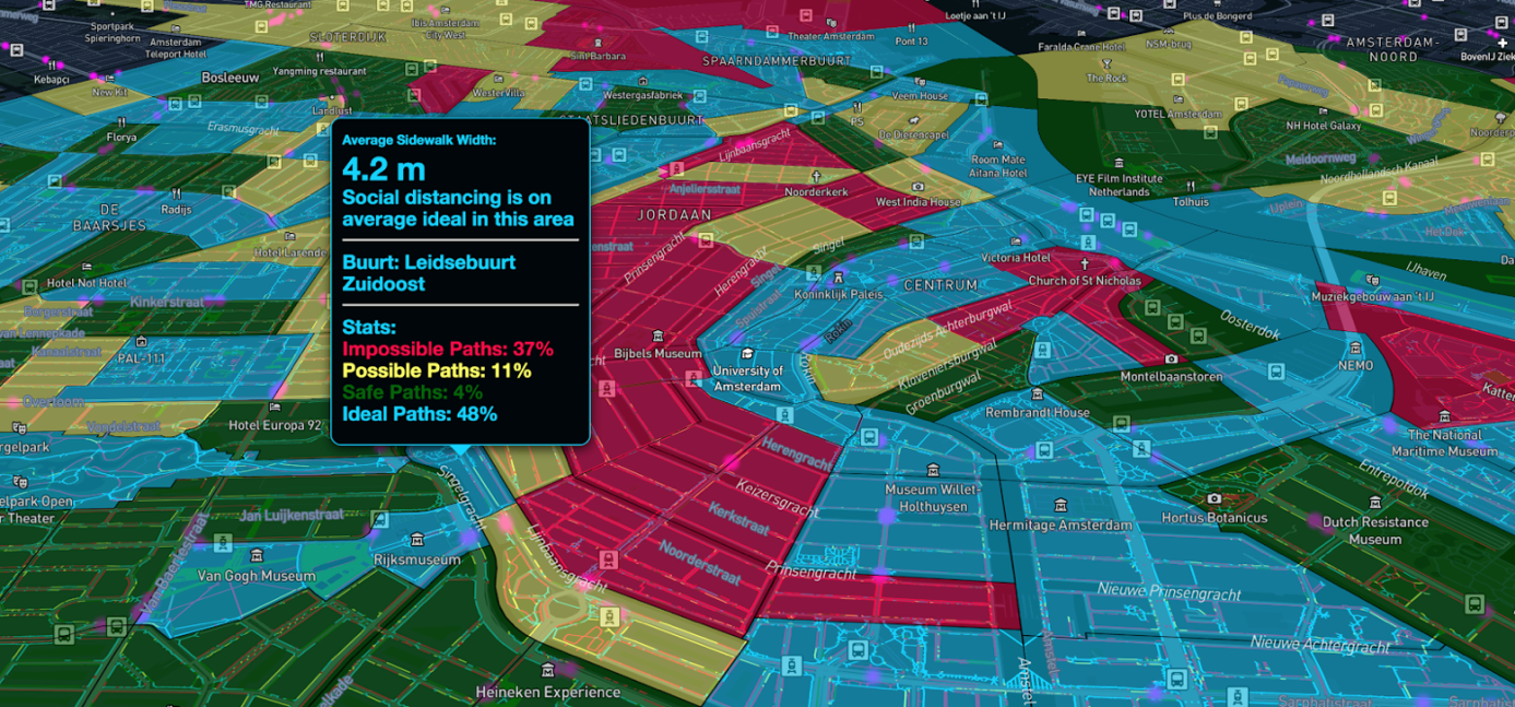
The Social Distancing Dashboard creates city maps that show on a street and neighbourhood level if social distance rules can be respected when moving in public space. It offers an overview of different factors – such as the width of the footpath and location of bus stops – affecting our ability to respect social distancing rules.
The dynamic and colour-coded maps are open access and available for use by e.g. policymakers, charged with making decisions on public health and city planners, tasked with making COVID-19 related interventions in the urban space. The dashboard is also intended to raise awareness amongst city residents – especially those in risk groups – who want to navigate the city streets as safely as possible.
The team of researchers, led by TU Delft’s Faculty of Industrial Design’s Assistant Professor and Research Fellow at AMS Institute, Dr. Achilleas Psyllidis, kicked off the project with a dashboard for Amsterdam. More dashboards are in the making for other cities such as Rotterdam, Delft and The Hague.

Data driven design
The dashboard fuses high resolution data from the Basisregistratie Grootschalige Topografie, the Centraal Bureau voor de Statistiek, and OpenStreetMap to automatically estimate the width of footpaths and classify them according to a risk profile. The use of high resolution datasets means that it is possible to perform analyses at different scales, ranging from postcode areas to neighbourhood, district, city, and regional levels, offering local, as well as high-level insights into social distancing in a city-setting.
Moving in public space while keeping social distance
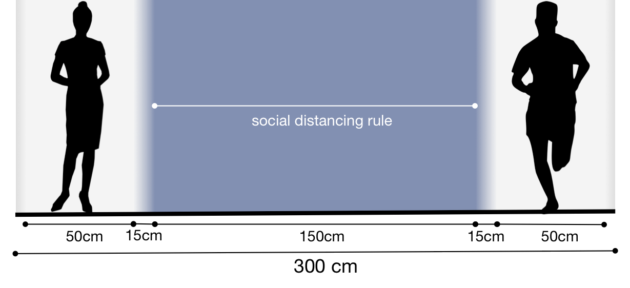
For a footpath to facilitate social distancing, it has to allow for two people to walk side-by-side (in the same or in opposite directions) without stepping off the path. This translates into a minimum width of between 2.5 metres and 3 metres. Consequently, many of the streets in the canal districts of central Amsterdam show up as red: in other words, these are streets where social distancing is difficult due to the physical constraints of the urban environment. A pattern that will be similar for many cities in the world, and especially applies to the often narrow streets of historic city centres.
Undaunted by the swathe of red on the map, the City of Amsterdam sees the Social Distancing Dashboard as an opportunity. Chief Technology Officer, Ger Baron: “This map visualizes the challenges for residents to live in the 1.5 meter society and for governments to design it. We can use this map to compare the red and orange highlights with the actual situation on the streets. The data will help us to come up with interventions, new ways to organize public space and work in a transparent way together with citizens and businesses.”Dr. Psyllidis comments: “This COVID-19 crisis has shown again the importance of data in decision making, and in the design of country-wide strategies that are guiding us in the ‘transition phase’. We believe that all city stakeholders should be empowered with tools that support decision making at the local or even personal level, so that interventions can be designed with complete knowledge of the context within which they take place. Our Social Distancing Dashboard project is one example of how we could make this happen.”
Next steps
The goal of the Social Distancing Dashboard is to provide an overview of different aspects that affect the ability to respect social distancing in public spaces. The current dashboard includes information about the width of footpaths and public transport locations. As there are more factors that impact social distancing, the researchers are planning to also include information about other points of interest (e.g. facilities like supermarkets or other high traffic locations) and other types of data (e.g. mobility data, occupancy data etc).
The current Social Distancing Dashboard is automatically calculated, meaning it has not been manually verified, therefore there is a small risk of minor errors. The Basisregistratie Grootschalige Topografie provides the best digital map of the Netherlands but it does not account for new interventions being worked on by several municipalities that facilitate social distancing, for instance blocking car traffic. The research team plans to collaborate with interested municipalities, to update the data and make it closer to the current reality.
More information and contact
Here you can access the Social Distancing Dashboard. High resolution images from the dashboard visualizing the analyses for the city of Amsterdam can be downloaded here (©TU Delft/AMS Institute).
Inge Snijder, Press Officer TU Delft, i.snijder@tudelft.nl, 06 14 75 95 17
Debby Dröge, Head of Communications at AMS Institute, debby.droge@ams-institute.org, 06 40 74 89 87
