Field study of OV-chipkaart usability
OV-chipkaart usability assessment
Problem statement
The OV-chipkaart is the Dutch system for electronic ticketing in public transport. The system is unique in terms of scale, with its nationwide coverage in a considerable geographical area, and its complexity, with many parties involved (operators, suppliers, governments), many modes of transport and types of tickets. During its introduction aspects of the system proved to be suboptimal in terms of usability.
Goal
To assess the patterns of use and usability problems in the Dutch system and to identify possibilities for improvement, by conducting a field study of the use of the OV-chipkaart and benchmarking this with field studies of existing smart ticketing systems in Hong Kong (Octopus) and London (Oyster).
Deliverables
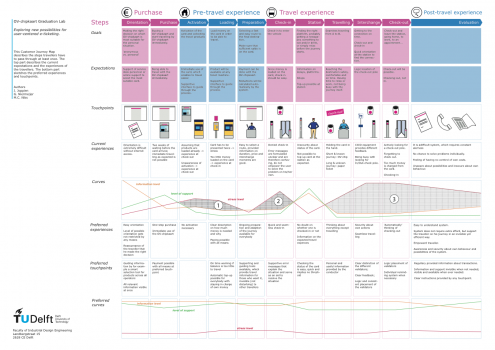
The results of the analysis have been documented in a report, customer journey map (in Dutch) and in an animation (in Dutch, with subtitles).
Approach
This was done through extensive traveller observations, interviews, diary studies, questionnaires, literature review and expert interviews (conducted between September 2012 and January 2013).
Problem statement
The OV-chipkaart is the Dutch system for electronic ticketing in public transport. The system is unique in terms of scale, with its nationwide coverage in a considerable geographical area, and its complexity, with many parties involved (operators, suppliers, governments), many modes of transport and types of tickets. During its introduction aspects of the system proved to be suboptimal in terms of usability.
Goal
To assess the patterns of use and usability problems in the Dutch system and to identify possibilities for improvement, by conducting a field study of the use of the OV-chipkaart and benchmarking this with field studies of existing smart ticketing systems in Hong Kong (Octopus) and London (Oyster).
Deliverables
The results of the analysis have been documented in a report, customer journey map (in Dutch) and in an animation (in Dutch, with subtitles).
Approach
This was done through extensive traveller observations, interviews, diary studies, questionnaires, literature review and expert interviews (conducted between September 2012 and January 2013).
Insights from field study and the international benchmark
The primary usability problems of the OV-chipkaart system as it was functioning in 2012 were:
- Mental model: The underlying concept of the OV-chipkaart that travellers need to learn, the so-called mental model, is more complex than with paper tickets. Checking in and out, credit, travel products: they're all new concepts and not everyone understands this.
- Card acquisition: For a part of the traveler population it is unclear where and how they can acquire an OV-chipkaart. This can be done in multiple places and in multiple ways. After applying for a card travellers have to wait too long for a personal OV-chipkaart and in some cases they also need to 'activate' the card or desired travel products.
- Choosing travel products: The various transport operators are offering a large number of travel products. Travellers find it hard to make the right choice.
- Too few benefits: In they eyes of a part of the travellers there are too little benefits to balance out the effort it takes to learn the system and acquire a card.
- Checking in and out: Travellers can forget to check in or out in places where the travel domain has not been closed off by gates or if there is no staff there to remind them.
- Inconsistent touch points: The equipment, websites and people that the OV-chipkaart user has to deal with - the touch points - don't behave consistently. Even though they have the same function. Travellers consider the OV-chipkaart to be a nation-wide system, and thus expect the same rules and behaviour everywhere. The terminology that is used is often inconsistent as well as unclear.
- Traveller status invisible: On the old, paper ticket a lot of information was printed. For example whether the traveler held a valid ticket, comfort class, season ticket arrangements, etc. With the OV-chipkaart this 'status information' has become invisible and this makes travelers feel uncertain.
- Solving problems: If travelers have a problem, the system does not give a sufficient explanation of what the issue is and how it can be solved. Travelers also often do not know which organisation to turn to.
Background of usability problems
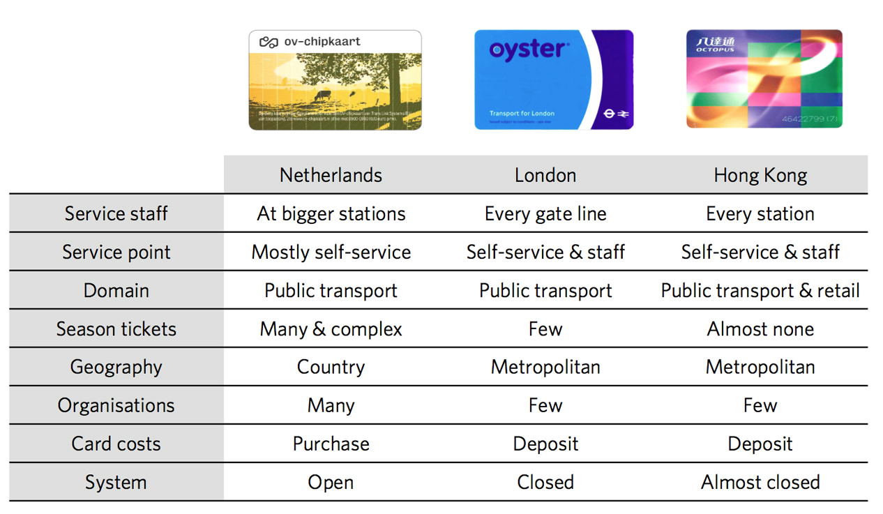
A part of the usability problems seem to arise from the fact that the OV-chipkaart system is more complex than comparable systems in Hong Kong and London (see image in the sideline). The Dutch system:
- Covers a larger geographical area;
- Involves more transport operators and other stakeholders;
- Provides more season tickets and travel products;
- Is a for the larger part open system (no gates).
Apart from this design choices have been made where more attention was paid to technology and business considerations than to the user perspective.