Case 2: Evolution of research
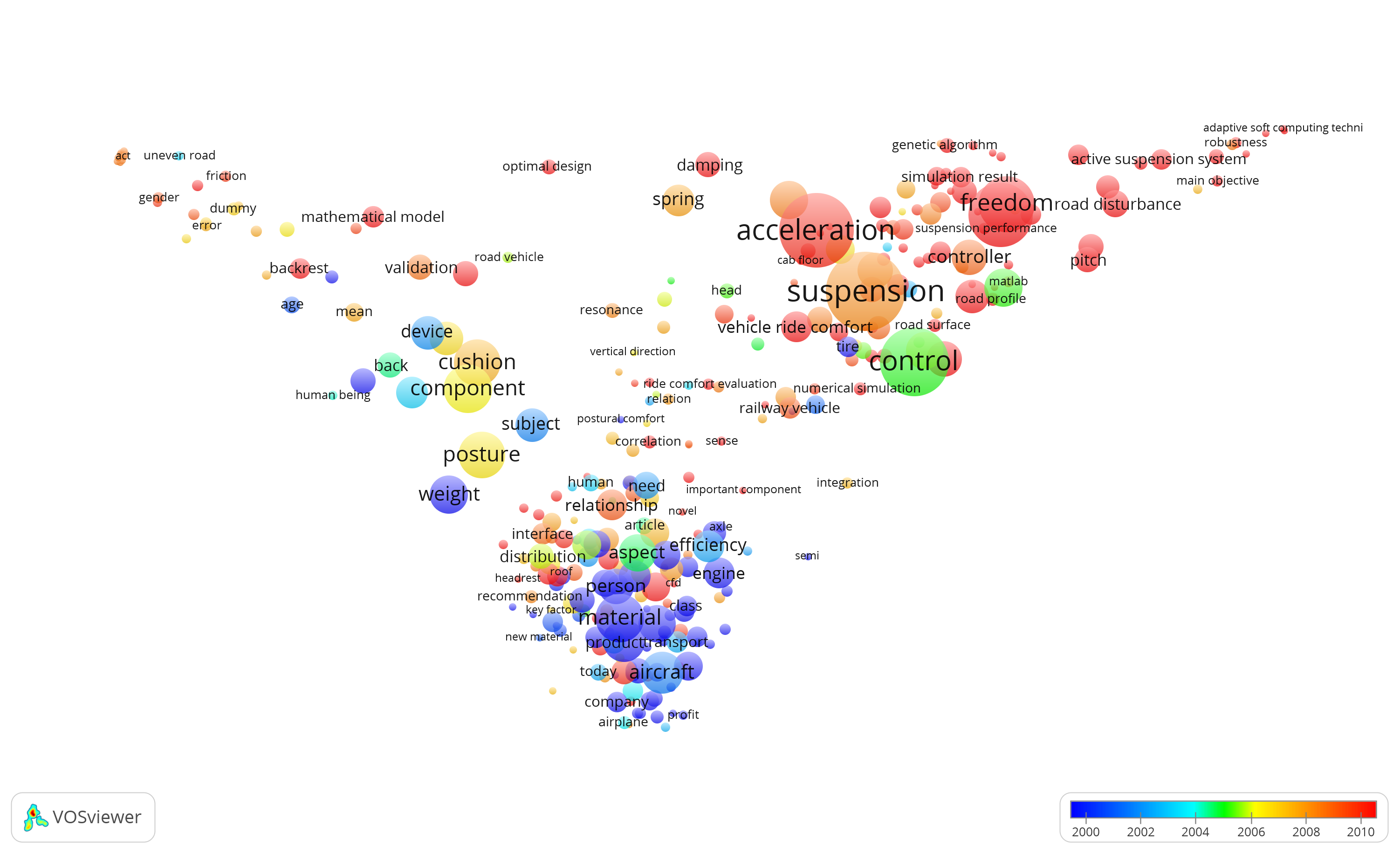
This term map shows the state of the art in research on Passenger Comfort. The overlay color of each circle corresponds to the average publication year of all the papers that include the corresponding term. In this map, the terms with cold colors (e.g., blue color) represent the research activities with older average publication year and the terms with hot colors (e.g., red color) show the terms with more recent average publication year.
What
Illustrates the evolution of a research area over time
Why
To understand the trend of research from the past to present
Who
PhD candidates, researchers, supervisors and policy makers.
How
After visualizing the state of the art of a research are similar to State of the art overview you can the VOSviewer “overlay visualization” feature to color the circles with the average publication year corresponding to the terms.
Data
case2.zip file contains data.csv that consists of 2000 records extracted from Scopus, map.txt and net.txt that can be used to open the visualization in VOSviewer, and the visualization.png that is the visualization shown in this page.