
Improved Features
Grid Element behaviour on smaller screens
TYPO3 distinguishes 5 different screen sizes, ranging from Extra Small (XS) to Extra Large (XL);
- XL: Fullscreen browsers on a modern screen
- L: Older desktops or non-maximized browsers
- M: Larger tablets
- S: Smaller tablets (such as iPad mini)
- XS: Phones
This is an approximation, depending on the exact resolution of your screen. It's possible to generate a Medium render on your phone, or an XS render on your desktop.
Before this release, TYPO3 made no significant difference between M, S, and XS in the way it treated Grid Elements; meaning that our website would show the same on your phone as it would on your large tablet (see the 'old screenbreak' image on the top right). Furthermore, we received feedback from (mostly Apple) users who would see this mobile view on their desktop screens as well. Since most of our pages are not optimized for mobile phone users, but rather for desktop users, that made our website difficult to browse. Also, on 'larger small screens', cards would be stretched very wide, making the image crops look unfortunate at best.
So; we have made some changes.
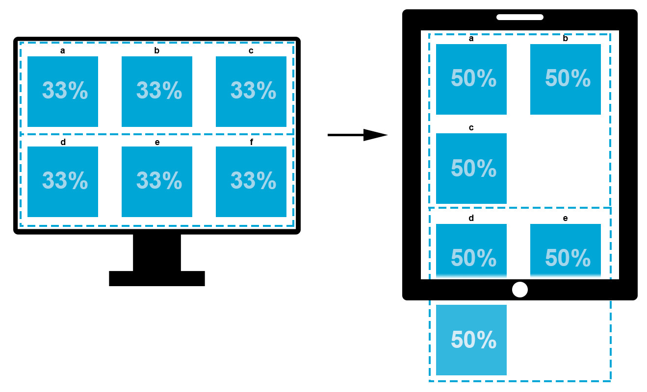
On Small and Medium screens, TYPO3 now always keeps two columns next to each other, instead of instantly reverting to only one column. This will show more information on one screen, and it also means that cards are never stretched out over the full length of the page - unless you choose to, of course. Play around with your web pages to see its effect! On the right, you can see two graphic representations of specific grid handling in the new screen breaking protocol: 4x25% and 3x33%.
This improvement sparked another:
Old vs. new

33% grids:
Adaptive grid
If you have just three cards in a row in 33%, the 33% grid break displayed above will be just fine. But the example shows two rows of cards, which (when broken) creates lots of whitespace around the cards. Especially in people or project overviews, this is not a pretty look. So for these overviews specifically, we have created a new element.
It's a grid! And we call it the Adaptive Grid.
This will keep your 33% grids connecting and in order. How it works:
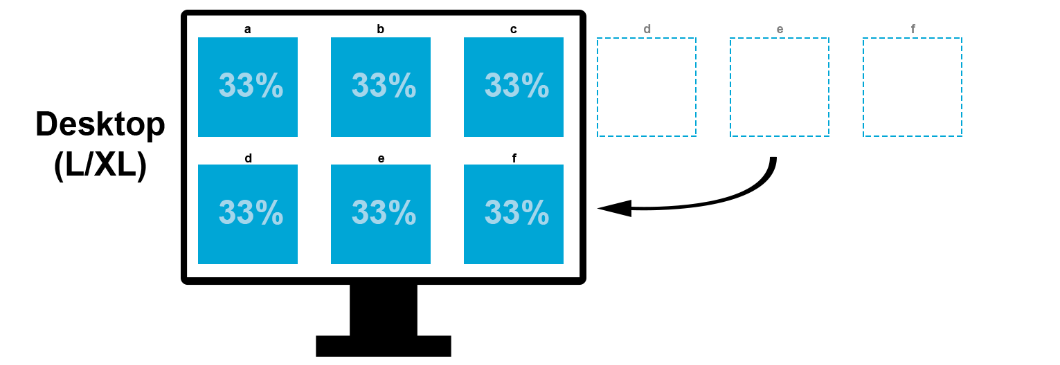
- TYPO3 shows you two rows of three columns.
- But behind the scenes, these are actually six columns next to each other.
- On XL and L screens, it will break after three columns, displaying the content in the same configuration you place them in the backend.
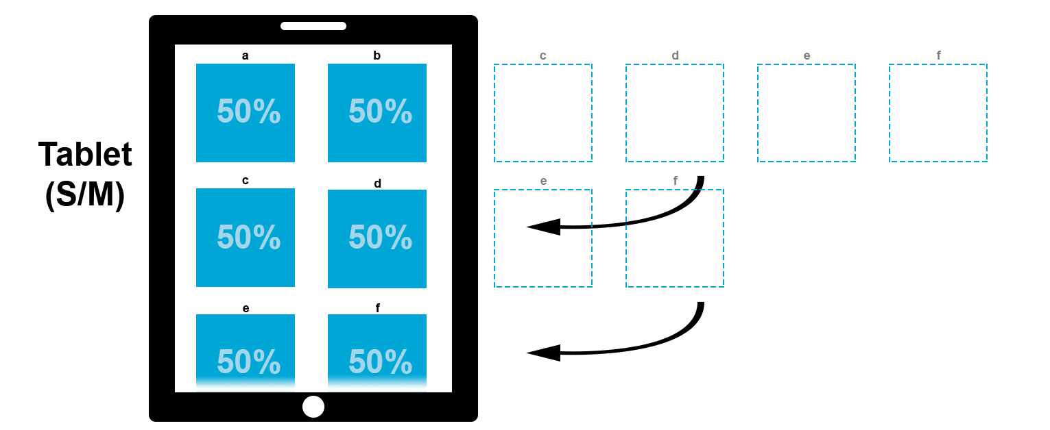
- On M and S screens, it will break after every two columns, which means you will have three rows of two columns.
- On XS screens, it will break after every one column, which means you will get six rows of one column.
This behaviour is also illustrated on the images on the right. Please note that every blue block represents the contents of a column, not necessarily one card. It may contain more than one element, and may not have any cards. The height of a row is determined by the column with the highest contents, as was already the case before.
For larger 33% card overviews, you probably currently use one grid per 3 cards. We would advise you to replace two 33% Grids with one Adaptive Grid.

Navigation menu (...) on mobile devices
The old top navigation had some issues when browsing on a mobile device. For instance, navigation items could not be expanded, forcing unnecessary clicks.
With this release we've adjusted this behaviour and added some minor tweaks as well. On the right you can compare both the old and new menu. Also, you can just size down your browser (or visit on a mobile device) and click on the (...) icon.
Old menu
New menu
Image cropper & focal point
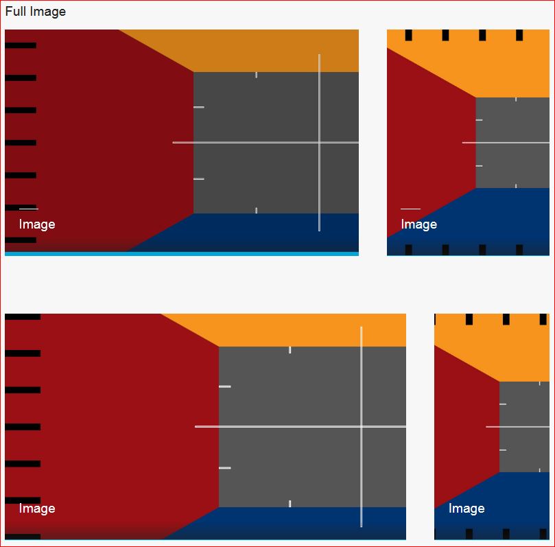
There were more than some issues regarding the image cropper and focal point editor. Alhough both nice features, the results (especially when using the image cropper) could sometimes be quite unexpected.
So, we made some major improvements to it. Noticably, the unexpected 'zoom' factor in the focal point editor has been removed and overall selecting your image/focal point has improved drastically, resulting in far more predictable results.
On the right you can see a comparison based on the same source, but also feel free to experiment with both the cropper and focal point editor yourself.
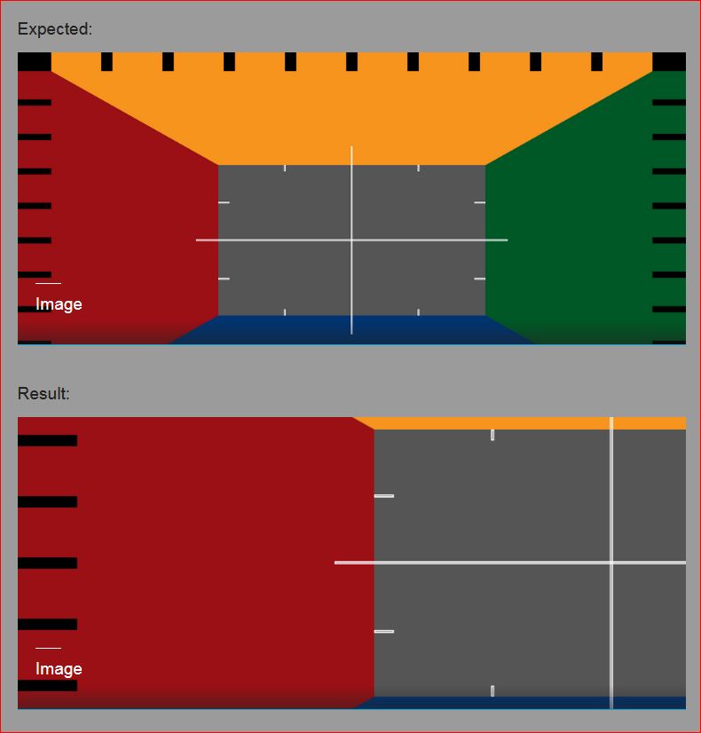
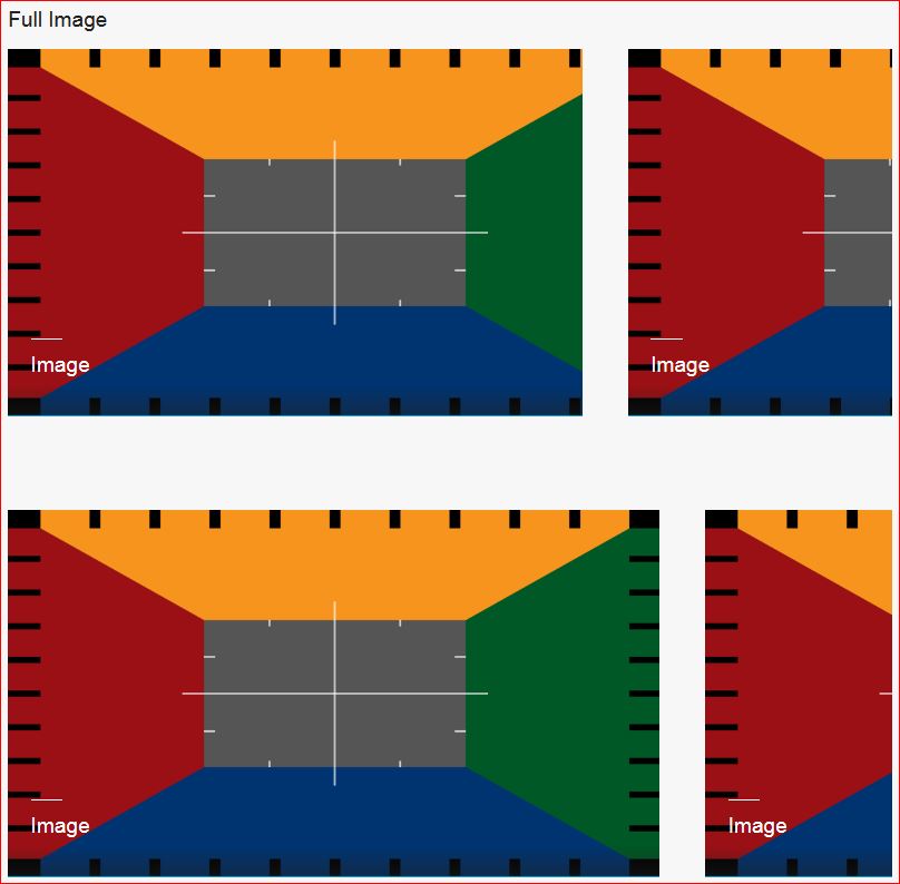
In all examples shown on the right, the focal point has been placed at the top left corner; the expected behavior is that the black stripes in both the top and the left of the image will remain visible. As you can see, in the old situation, these marks are almost never fully visible. The new situation however is exactly as the expected situation.
Long story short: all images containing a focal point are drastically improved and behave as expected.
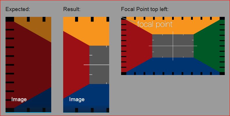
Old situation - focal point in top left corner
New situation - focal point in top left corner
7:2 Header Slider ratio in image cropper
When processing an image to use in a Header Slider, TYPO3 makes a specific, very wide crop, that corresponds with the average Header Slider size on a large screen. From this initial crop, all other adaptations for smaller screens are taken.
To make this image processing for Header Sliders more predictable for users, we have added a crop ratio that closely resembles that auto-crop by TYPO3. Basically, that means you can decide on where to crop, instead of the system doing it for you. We recommend using this feature for all Header Sliders from now on, whenever your image has non-abstract content.
This crop ratio is roughly 7:2. Use the now improved focal point editor (after saving your crop first!) to decide where to focus on smaller screens.

Image cropper 7:2 ratio
