New Features
Location element
Over the past few years we've seen quite a bit of (google) maps embedded on TU Delft webpages, but all of these were based on iframes, which is not always the ideal situation.
Therefore we added our 'own' location-element, based on OpenStreetMap. With this new element you can add scalable, adjustable maps to your pages, including a marker/point-of-interest to further highlight your content.
Size-wise; the element is based upon the same height as cards (both half and whole cards), so you can easily combine maps and cards on the same page, aligning both element-types properly.
Regular height layout
Regular height layout
Half height layout
Half height layout
Lightbox images
Sometimes, when adding images, you would probably think that it would be nice to show the picture in full high resolution or even 4K. On the pages itself, this is constrained to a maximum width, mainly for page loading / network optimalisation.
You can imagine its quite a drag when you're loading over 25 Mb for a single picture for everytime you load that page.
But it would be nice if you could offer a 'click-to-enlarge' feature, so you can keep the page itself compact, but still offer that 4K image. Well, now you can!
After adding an image to your page, simply check the 'click-to-enlarge' setting. When visiting the page itself, clicking the image will give you a nice lightbox-popup for the selected image (-crop), including an additional zoom for displaying the total image(-crop).
Full image
Image crop
News and Event card overviews
Last year we introduced dynamic overviews with a card layout and even though earlier this year we added some additional styling options, there still was something lacking in order to correctly use this layout for news and/or event articles.
So, in order to fully facilitate these types of articles, we have added (either) the publish or event dates, as you can see on the right.

Event article with event date
Landscape image for the Special template
Our 'special' / longread format can give your article just that bit extra, but only when done right. This means extra care when building this type of page. In most views this format uses the left pane for images and the right pane for the story. However, when switching to smaller screens, such as mobile devices, the left pane is relocated to the top part of the page resulting in your carefully selected portrait image being adjusted for a landscape size.
In order to fix this issue, we've added an additional image field "Background image landscape".
Original Special image
Old mobile version
New optimized version
Dynamic Overview tweaks
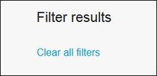
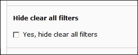
Hide 'Clear all filters' button
When creating dynamic overviews, sometimes it helps to split the multiple facets in order to add some additional context.
Previously this had the drawback of displaying a 'clear all filters' button for each facet. So we made this button optional.
Please keep in mind: overviews are difficult to set up properly, so changes to your current template are not done by editors. If you need a new overview or need some changes to your current overview, please consult your local content manager.
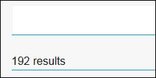
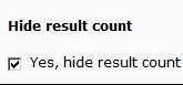
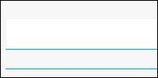
Hide 'results'-counter
When adding a searchbar to a dynamic overview, it automatically places a results counter beneath it. However, since this is not always necessary or wanted, we also made this field optional.
And, as with all dynamic overview settings and adjustments: Please consult your local content manager for any changes.