
Creating order in chaos: data visualization
If you want to know more about the research of Thomas Höllt, you could simply have a look at his work. It should – for the trained eye – speak for itself. And what you will see, will vary from the dispersion of proteins in cells, to the different layers in an old Vermeer painting. His visualization platform does not only help biologists to understand how the immune system works, it also helps them to get to the roots of diseases and come up with specialized treatment. And it can also be used to identify and chart invaluable paintings and could have many more applications. “I think it’s really motivating to see that researchers can use the platform that I developed to make scientific discoveries”, says Thomas excitedly.
Clear, understandable, and interactive images
With the help of data visualization, researchers can create order in chaos. “Computer graphics can, for example, be images generated for a cartoon movie. But I work in the field of visualization, which is related to computer graphics,” explains Thomas, “yet a little bit different.” Within visualization researchers generate images based on data. “Through the visualization we want the information from this data to be as easy as possible for our human visual system to understand,” explains Thomas.
In other words: data visualization is used to create clear, understandable, and interactive images that represent data sets with a large amount of complex information. Thomas works on algorithms to create these visuals efficiently. “I mostly work with data that is high dimensional. This means that every item in the data set can be described by many variables or attributes”, clarifies Thomas. This can, for example, be biological data. A data set with DNA sequencing measurements can have thousands of genes that describe a single sample or single item in such a data set. “We as humans have a very hard time to imagine what such high-dimensional data looks like”, says Thomas. “That is why I develop methods to visualize this data in a way that we can actually understand it on a 2D computer screen.” But creating the visualizations is only one aspect, says Thomas. “We combine visualization with interaction. We allow the person looking at the visualization to zoom into the visualized data, to filter for specific properties, or to combine multiple visual representations to get different perspectives on the data.”
Visual platform for millions of cells
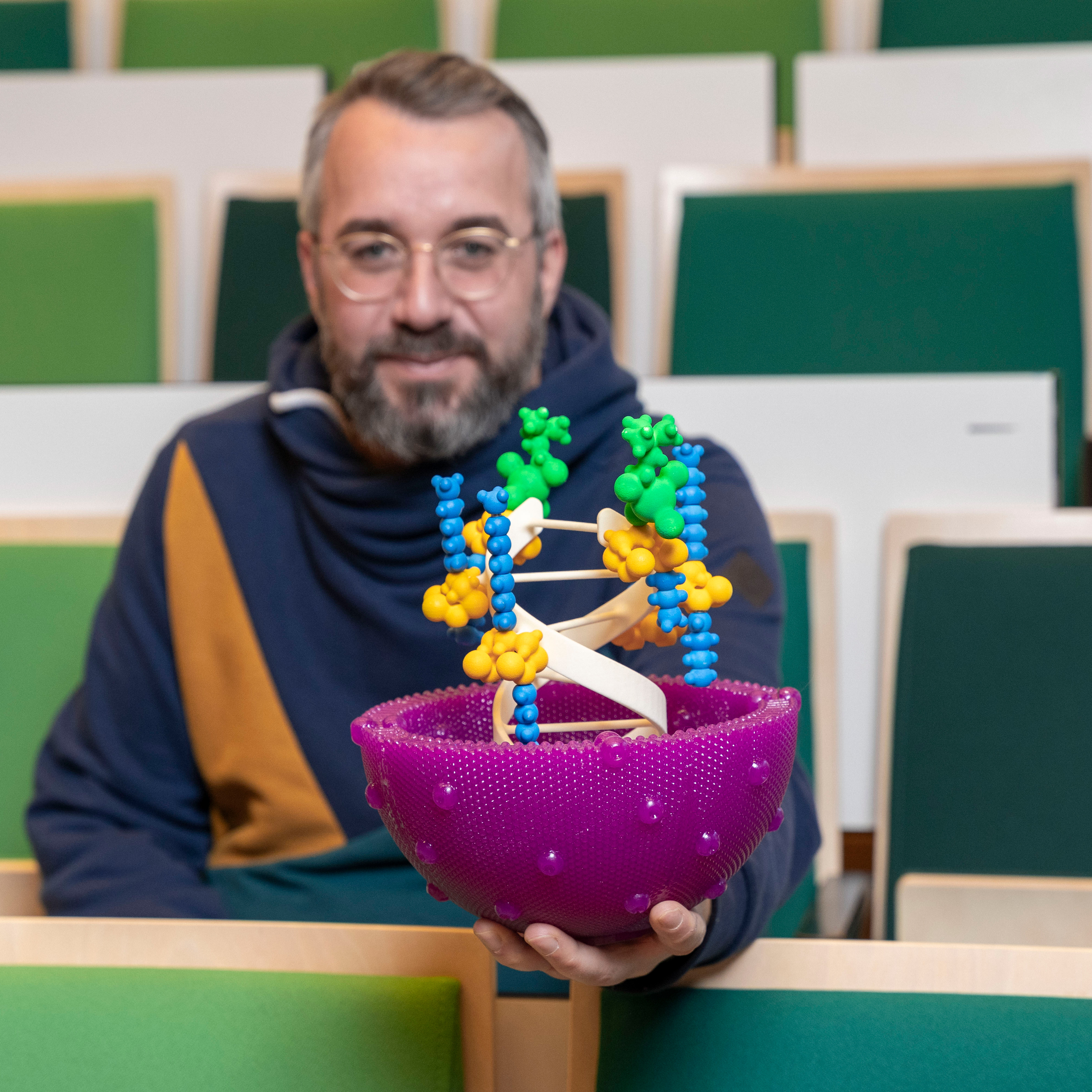
“I started as a postdoc at TU Delft eight years ago”, says Thomas, looking back. He immediately started a collaboration with the Leiden University Medical Center (LUMC). “At the LUMC they had just gotten a new machine that allowed them to determine the properties of cells, called a Mass Cytometer”, explains Thomas. With this machine, researchers can use blood or tissue samples from volunteers to extract information from individual cells.
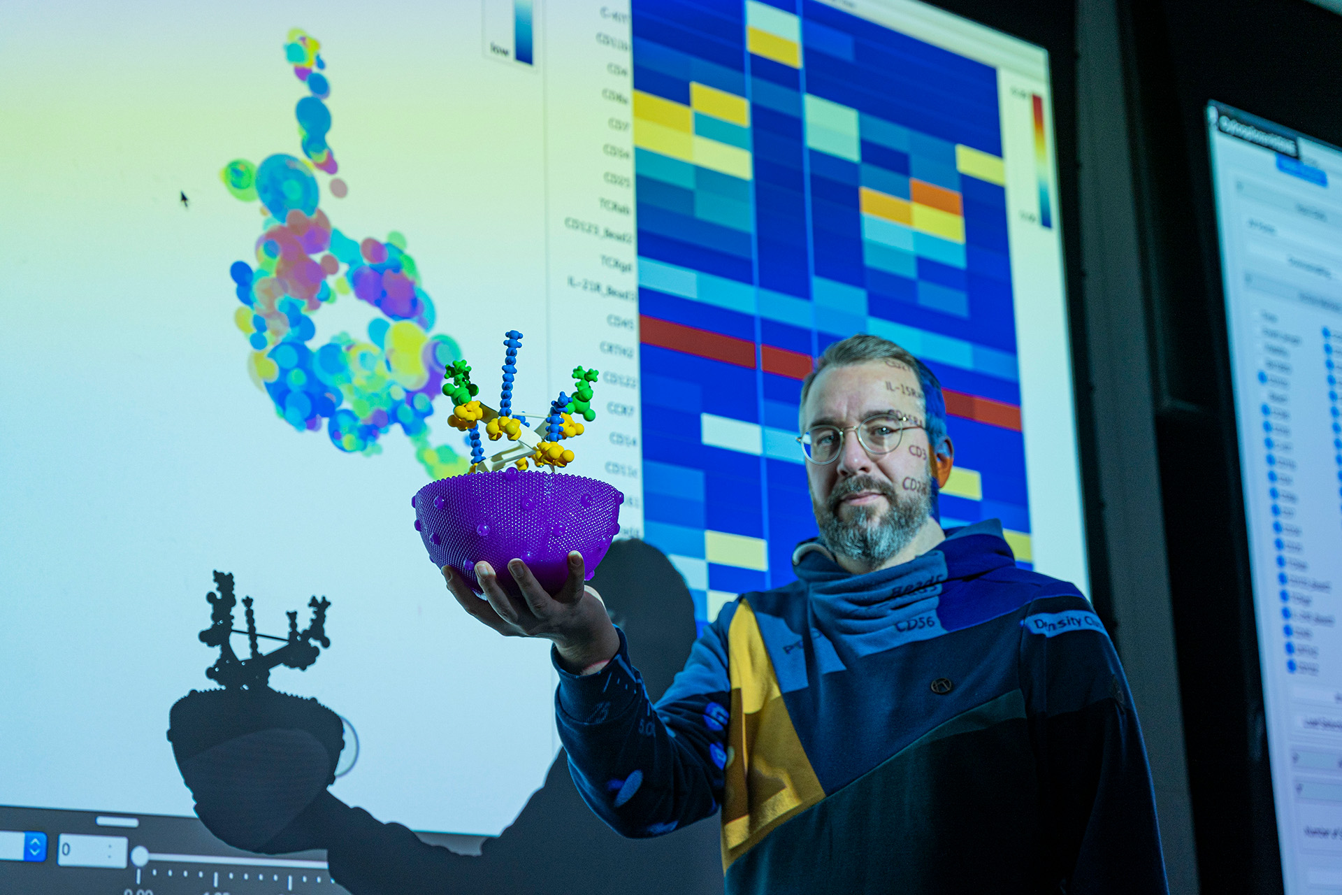
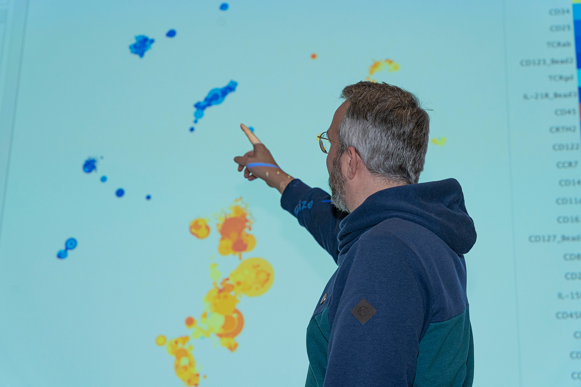
Researchers at the LUMC back then had gathered data on millions of cells in a data set. “I started working on a software that they could use in the hospital to actually look at the data”, says Thomas. “And that became what is now known as the Cytosplore platform. Which is an interactive visual analysis system which allows researchers to understand how the immune system works. It’s goal is to provide a clear picture of the composition of immune systems cells and their properties and functionality.” When you look at the Cytosplore platform you can see that the cells, the proteins, and the cell properties are all represented by different coloured dots, of different shapes and sizes, and at varying distances from each other. And you can also zoom into the data, and discover more about the properties of a cluster of cells or proteins. The patterns within these clusters give researchers a lot of insights into the cells.
“When we first started researchers had thousands of cells in a dataset. Now there will be millions of cells in a typical dataset. The largest dataset we had contained roughly 30 million”, he adds. “And the proteins that we can measure are around 50 per cell at the moment. The software could technically handle even more.”


Going to the root of diseases
With the help of the Cytosplore platform, biologists can identify whether the cells of patients with a certain disease have different characteristics than those of healthy people. It can give insights into the differences in the composition of the immune system cells, as well as information about the different states of a disease.
“It can be used to study autoimmune disorders, like Crohn’s disease. This type of research can be used to improve gastrointestinal health”, explains Thomas. The platform can also be used to study diseases like malaria and certain types of cancer, and it could perhaps even pave the way for specialized treatments or medication for diseases. “Different types of cancer, for example, are also different per person”, illustrates Thomas. “Gaining insight into the make up of someone’s cells gives valuable information towards personal treatment.”
Gaining insight into the make up of someone’s cells gives valuable information towards personal treatment.
Not a pipeline
“There are other – similar – tools out there, that also use visualization. But they are like a pipeline. You put data into the pipeline on the one end and a visualization comes out on the other side”, clarifies Thomas. Researchers have to trust that everything that happens in this pipeline actually works. If, for example, the clustering of data did not go well, they have to go all the way back to the beginning.
Through the Cytosplore platform, researchers can look at the data at every step of the analysis. If there's a grouping of cells – so a group of similar cells – researchers can immediately see the outcome. When researchers look at this data set, the grouping actually makes sense. “This interactivity and actually showing the data at every step in the analysis process is what makes it different, I would say, from other methods in the field”, says Thomas.
Uncovering the secrets of Vermeer
“But besides my collaboration with the LUMC, I also worked with the Rijksmuseum”, shares Thomas. In this field, visualization is used for the imaging of paintings. There are visualization methods that can, for example, measure which chemical elements are at certain positions in a painting. “Visualization is very useful for this field because this is also high dimensional data. Every pixel is described by tens of chemical elements”, explains Thomas. The visualization shows the distribution of different pigments in the painting or how they are layered. This helps researchers to identify all the different parts of invaluable paintings.
Thomas explains that there could be many more applications of visualization platforms. “For example within insurance companies. Every insurance case contains a lot of information and that also forms a high dimensional data set.” Insurance companies can – for example – use visualization methods to group or visualize fraud cases in a larger dataset. And if these fraud cases are in a group with other cases, those might also be fraudulent.
“Visualization platforms can be used very effectively in every field with data that consists of a large number of variables or attributes”, shares Thomas, “like the visual arts and all types of industrial applications.”
Making the platform self-explanatory
“Sometimes I am afraid that the software I create is not used with enough proper understanding”, states Thomas. “I remember a paper for which they used the software and they did an analysis that made absolutely no sense, at least from my perspective.”
Thus, one of the things Thomas focusses on is to make his visualization tools in such a way that they are self-explanatory. “I'm working on this question: Can I make the interpretation of the visual representation more fail-safe? I want to explain the algorithm that creates the visual representation with the visual representation itself. And I want to make sure that it is not misinterpreted. My ambition is to create tools that researchers can easily use. I want them to understand the outcome without the need for a deep understanding of the used methods or even the need for coding.”
Additionally, Thomas also faces some challenges when it comes to making the algorithms that he uses, faster and faster. “The computer is not keeping up with the speed of the growing data sets”, Thomas explains. “We cannot use supercomputers – like the DelftBlue supercomputer – to develop the software. Because the software that I build is really supposed to be running on normal machines, like a desktop computer or laptop. We want everyone to be able use it, also within hospitals, for example.”
Always space for visualization
“Data is becoming increasingly important in our society, and this will continue to be the case”, Thomas emphasizes. “Artificial Intelligence (AI) will be used more and more in the coming years to analyse data automatically. But there is also an increasing recognition that we cannot leave critical decisions to AI alone (this is even specified in an EU Directive). We will need a human in the loop, who makes the final decision, while using AI generated information. And we will need some way to communicate the AI-generated information to the human that makes the decisions. Often this information will be provided in visual form. How to do visualize this information will continue to be a big part of our research. There will always be space for visualization.”
Incredibly motivating
“I love seeing that something I imagined and implemented actually helps other researchers make new (life science) discoveries”, concludes Thomas excitedly. “I see visualization as an enabling science. It really motivates me to see that we made a tool, like Cytosplore, out of nothing, through software. At some point we thought about this and we worked it out, and then seeing that researchers can actually use it. That is why I do this type of research.”


