
New Features
Sticky elements
Maintain focus on important content while scrolling
Sometimes it would be very neat if you could keep content visible while scrolling down a page.
For that purpose, we've (finally?) introduced Sticky Elements.
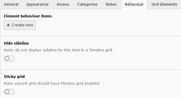
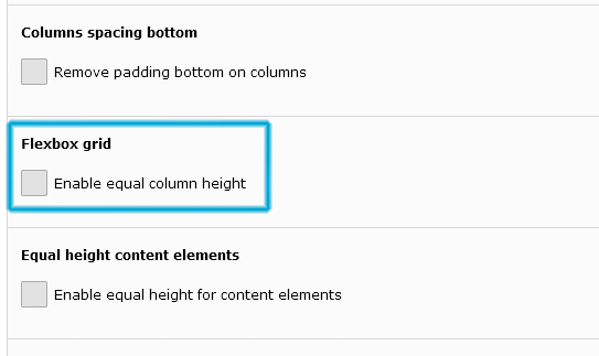
So, how does this work? Since we prefer working with grid elements as much as possible, you'll find the sticky setting on each grids Behaviour tab.
Enable the sticky grid (and don't forget to check if the parent/overarching grid is set to "flexbox" as seen in the following screenshots / slider.
So, let's create some lorem ipsum text and set the card on the right to sticky; it should remain visible when scrolling through the text.
Lorem Ipsum is simply dummy text of the printing and typesetting industry. Lorem Ipsum has been the industry's standard dummy text ever since the 1500s, when an unknown printer took a galley of type and scrambled it to make a type specimen book. It has survived not only five centuries, but also the leap into electronic typesetting, remaining essentially unchanged. It was popularised in the 1960s with the release of Letraset sheets containing Lorem Ipsum passages, and more recently with desktop publishing software like Aldus PageMaker including versions of Lorem Ipsum.
It is a long established fact that a reader will be distracted by the readable content of a page when looking at its layout. The point of using Lorem Ipsum is that it has a more-or-less normal distribution of letters, as opposed to using 'Content here, content here', making it look like readable English. Many desktop publishing packages and web page editors now use Lorem Ipsum as their default model text, and a search for 'lorem ipsum' will uncover many web sites still in their infancy. Various versions have evolved over the years, sometimes by accident, sometimes on purpose (injected humour and the like).
Contrary to popular belief, Lorem Ipsum is not simply random text. It has roots in a piece of classical Latin literature from 45 BC, making it over 2000 years old. Richard McClintock, a Latin professor at Hampden-Sydney College in Virginia, looked up one of the more obscure Latin words, consectetur, from a Lorem Ipsum passage, and going through the cites of the word in classical literature, discovered the undoubtable source. Lorem Ipsum comes from sections 1.10.32 and 1.10.33 of "de Finibus Bonorum et Malorum" (The Extremes of Good and Evil) by Cicero, written in 45 BC. This book is a treatise on the theory of ethics, very popular during the Renaissance. The first line of Lorem Ipsum, "Lorem ipsum dolor sit amet..", comes from a line in section 1.10.32.
This card is sticky
It should remain visible while scrolling down.This can come in handy if you want to keep focus on something.
Organisational units as logo extension
Adding your logo extenstion to your website

A long-requested feature has finally been developed; if your unit has an approved logo extension, we can add this to the top navigation of your website. This will also function as a 'home' button for the website, apart from the TU Delft logo which always leads to the TU homepage.
Adding the logo extension also separates the page navigation from the more 'meta' navigation (language switch, search button etc.), providing more breathing space for all the necessary items on display.
Please keep in mind that this is meant only for organisational units that already have an approved logo extension.
If you wish to use this extension on the website as well, please contact visualcommunication@tudelft.nl ; they will assess the request to add this to your website and notify us in order to implement this.
Timeline element
Share your story throughout the years
A brand new grid element has been introduced to our platform; the timeline grid.
With this grid, you can align (groups of) elements with a centered timeline. Below you'll find an example that uses a combination of this new grid, regular colored grids and grouped elements, so feel free to experiment with this one.
Notable TYPO3 releases
A new TU web environment was launched
In 2017 we launched our new online styling for websites, including a brand new revamped version of our CMS, TYPO3 v7.
This contained the basic framework we still use today such as grid elements and cards.
2017
Our first major release containing a plethora of new features, upgrades and bugfixes, such as the notification element, new page layouts and colored grids.
Notification element
This was first introduced in the 2017 Q4 release
Check out the full release notes2018
Starting in 2018, we added (amongst other things) new card styling to dynamic overviews, grid visibility settings, improved the contact element and added a customizable top navigation for news and events.
This year also contained our simple, yet effective, single button element, customized 404 and search pages as well as some improvements to header slider and quote element.
Additionally we added the location element, lightboxes for images and an overhaul of how tables were added to pages.
2019
2019 saw the introduction of a new gallery element, table preset styles and tooltips, as well as side-scrolling overviews and parallax images
Additionally, we made corrections to our colour palette, had to add a cookie statement (sorry), card gradients and support for mollie (payment platform).

2020 - 2021
A major platform upgrade was implemented, moving from TYPO3 v7 to the new and stable v10 platform, including a complete platform overhaul, new URL and redirect management and many features 'under the hood'.
Later that year we also released the new profile pages as our second major upgrade that year as well as improving our WCAG compliancy status by adding a contrast mode as well as improved coding.
2022
After over a year of massive upgrades and overhauls, we returned to the platform by adding single sign on, a brand new template builder and upgrading both url management and powermail web forms.
2023
2023 saw the release of our concept for digital magazines, a new colour palette and a new (more dynamic) header element as well as a related articles element and the behaviour-tab for custom styling.
And this also concludes our timeline thus far, although we will continu to add and improve our platform along the way.