Page Layout
Layout
We have many different page layouts. Some of these are straightforward; others require some instruction, or can be improved with tips & tricks. Only the remarkable page layouts are discussed here.
Pro tip: You can set a page type for all underlying pages of the page you're editing. Under 'Appearance', you'll find 'Backend Layout (subpages of this page)'. If the underlying pages have an empty setting for 'Backend Layout (this page only)', as is default, it will adopt the parent setting.
General information
Setting page layouts
All these layouts can be set in the page properties, in the tab Appearance, under 'Backend Layout (this page only)'.
Definitions
To avoid confusion, here's a list of definitions we use in the website layout. The numbers refer to figure 1 below.
| Ref | Term | Definition |
| Back-end: | Typo3 | |
| Front-end: | The website as a visitor sees it | |
| 1 | Top navigation: | The top-level navigation, for instance of a faculty or department |
| 2 | Header Slider: | An image element above the body (also just called 'header') |
| 3 | Breadcrumb (kruimelpad): | The hierarchical structure up to the page you are viewing |
| 4 | Side navigation: | The menu on the left of the page |
| 5 | Body: | The main area to place content (Main Column, in most Typo3 layouts) |
| 6 | Footer: | The blue bottom bar |
| 7 | Bottom navigation: | Black menu at the bottom, content identical to (1). |
Homepage
- The only regular layout without a breadcrumb.
- In this layout, you can edit the footer information. This is inherited by underlying pages, until a footer element in an underlying page overrides them, and so on.
- Be aware: when using a homepage layout anywhere but the landing page of your section, the visitor is easily lost, as there are no clues to their location anywhere on the page.
Content page: full width
- Combines the regular Content page with the Homepage: it's basically a Content page without side navigation (or: a Homepage with a breadcrumb).
- This layout was frequently created with a workaround (Content Page with Left Column, combined with specific element settings), which is why an official option has been included instead.
- Be aware: removing the side navigation could lead to visitors getting lost on your website, as they have less clues on their location.
Content page with left column
- A content page without side navigation. Instead, you can place your own elements in the side navigation area.
- A content area 'Aside' is added in the page view, where you can place these elements.
- Be aware: removing the side navigation could lead to visitors getting lost on your website, as they have less clues on their location.
Special Page
The Special Page is designed for magazines, long-read articles, and background information. To see what it can do;
View an example!This layout works by dividing the screen in two halves; the left one is designated for images, the right one for all content. There is also a special connection between picture and content, enabling a nice scrolling experience.
To create this layout:
- Select the Backend Layout 'Special Page'.
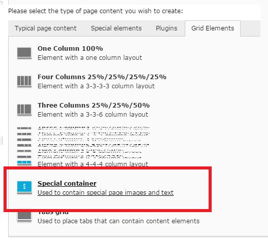
- Create a new element; under Grid Elements, select Special Container (see fig.). This grid consists of two columns.
- In the left column, you place a 'Special Image' element.
This is the image that is displayed stationary alongside the scrolling content on the right; when the visitor is at the end of the content in this Special Container, the image will scroll up, and display the next Special Container. - In the right column, you place a normal 100% Grid element.
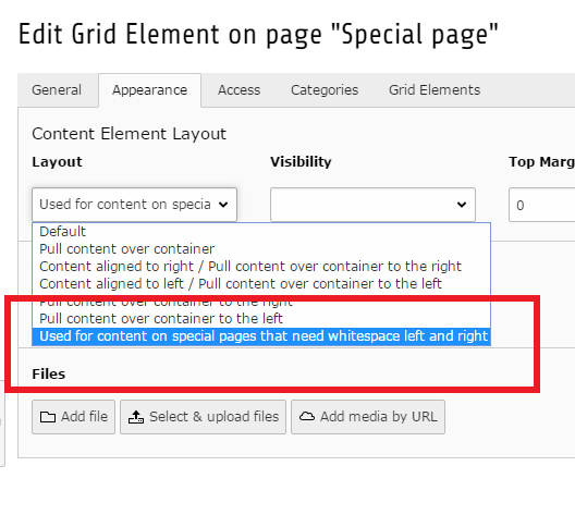
- In the element properties of this Grid Element, under Appearance, select 'Used for content on special pages..' (see fig.).
- Inside this 100% grid, you can place all elements to your liking.
The last steps, creating a 100% grid, are necessary to create the Special layout as it was designed. This element layout compresses the width of the elements within - otherwise, the text would run the entire width of the column.
Person Page
- A page that displays automatic information about a person.
Read more about People Pages under 'Basics'.