Images
Layout
On these pages, crude guidelines for the use of images are provided. Bear in mind these are technical tips; for image content, there is an Image Adviser at Corporate Communication - talk to your content manager for more information.
In general, there are two mantras in response to the question 'what kind of image should I supply?':
(and bigger is usually better) |
HD?
It stands for High-Definition, and basically means: very big. Modern screens and phones are almost entirely HD, if not better. If you have an image smaller than HD, most visitors will see an ugly, pixelated image. It will not break the page, but it will not look professional, and it will not look pretty. In a time where even phones take HD photos, there is no excuse anymore to use smaller images.
And usually, the bigger, the better. A 4K image (4096 × 2160 px) can be cropped more freely without resulting in a low resolution image. There are some exceptions, for instance when you have multiple large images on a page - loading time (and bandwidth usage for the visitor) will greatly increase. In those circumstances, consider cropping those pictures before uploading to Typo3.
Landscape?
As can be seen on the Cards example page, landscape pictures generally work better with our system, especially for cards and headers. It is not necessary, but it will make it easier to get close to the desired outcome.
-
Forget about DPI.
DPI, or dots per inch, is only used in printing. It basically means: the amount of dots your printer has to print per inch. Changing the pixel dimensions does not change the DPI. DPI just tells your printer how big you want to print your image on paper. But a web browser does not display inches; it displays pixels. If your screen is 1000 pixels wide, and your picture is 100 pixels wide, it will always display that image on 10% of the width of your screen, regardless if you have set it to 70 or 300 DPI. For web, just focus on the pixels, and nothing else.
But the pixel dimensions change when I change the DPI!
Your image editor might link those together, but it does not have to. You can have the exact same image, looking the exact same way on a website, but with two different DPI settings. Forget about DPI.
Okay! Anything Else?
Yes. The most important tip of all: try it out. See the effect of using different images. Because the website is 'responsive', it will look different in every screen. We can only supply a general impression, but by experimenting, you can find the best solution for your own situation. Use Ctrl- and Ctrl+ to zoom in and out and simulate a higher/lower screen resolution; narrow your browser window to simulate a phone screen.
We have some specific tips for often-used content elements:
Cards
Cards show a preview of what is behind the link - be it in text and/or images. Any image you put in a Card is therefore a teaser, an impression, an abstract figure.
Cards are responsive; they scale with the page. This means they look differently on every screen; images may be cropped to fit the changing shape of the card. If you have an image where displaying the exact scene is important (a historic handshake, a logo, a portrait), a Card is the wrong choice. You should probably place those pictures (as an Image Element) on the page that Card links to.

Regular Text Element
In the Rich Text Editor (RTE) of a Regular Text Element, you may have noticed you can also add images. This is indeed possible, but with disadvantages:
- The image is limited to 300 pixels in width
- The image is not responsive (see: Cards)
- Images pasted with the text (for example, from MS Word) are removed after saving
- Editing image properties in the RTE interface is not supported
It has been a deliberate choice to set the system up this way. It stimulates the user to create a separate image element, and think more consciously about its position and added value. It also discourages an editor from blindly copying a flyer or paper article to the web - different media require different approaches.
 The reason there is still an option to include images in the RTE, is so you may include small icons or thumbnails in the text. But please use with great caution, as YOU may find them beautiful, but others will find them horribly ugly. Also, playful green arrows are definitely not in the TU Delft style guide.
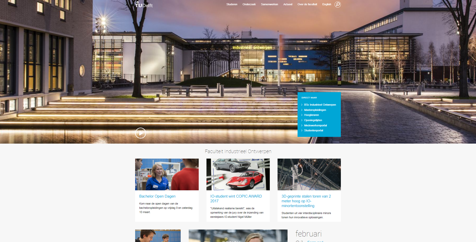
Header Sliders
When it comes to Header Sliders, images behave pretty much similar to cards, but with different dimensions. Since this element has a completely different purpose than cards, there are some other things to consider though:
- There is most likely a title across the image. If the colours in the image make the text unreadable, consider adding a dark gradient to the slide; this option can be selected at the bottom of every slide.
- This image will always span the ENTIRE width of the screen (see below), while cards are ultimately limited to the maximum content width of 1260 pixels. On modern screens, the header may well exceed the 1920 px width of HD images, with 4k screens slowly becoming the new standard. In other words: be even more cautious about using low quality pictures.
- You have the option to select a separate image for mobile screens, since those header sliders are much more square than rectangular.
- If the title in one slide is significantly longer than other slides, you will notice the header slider changing height when scrolling through slides. This is caused by your title taking up more lines of text than the other titles. Basically: avoid long titles. That, by the way, is good advice anyway regardless of this element.