Cards
Layout
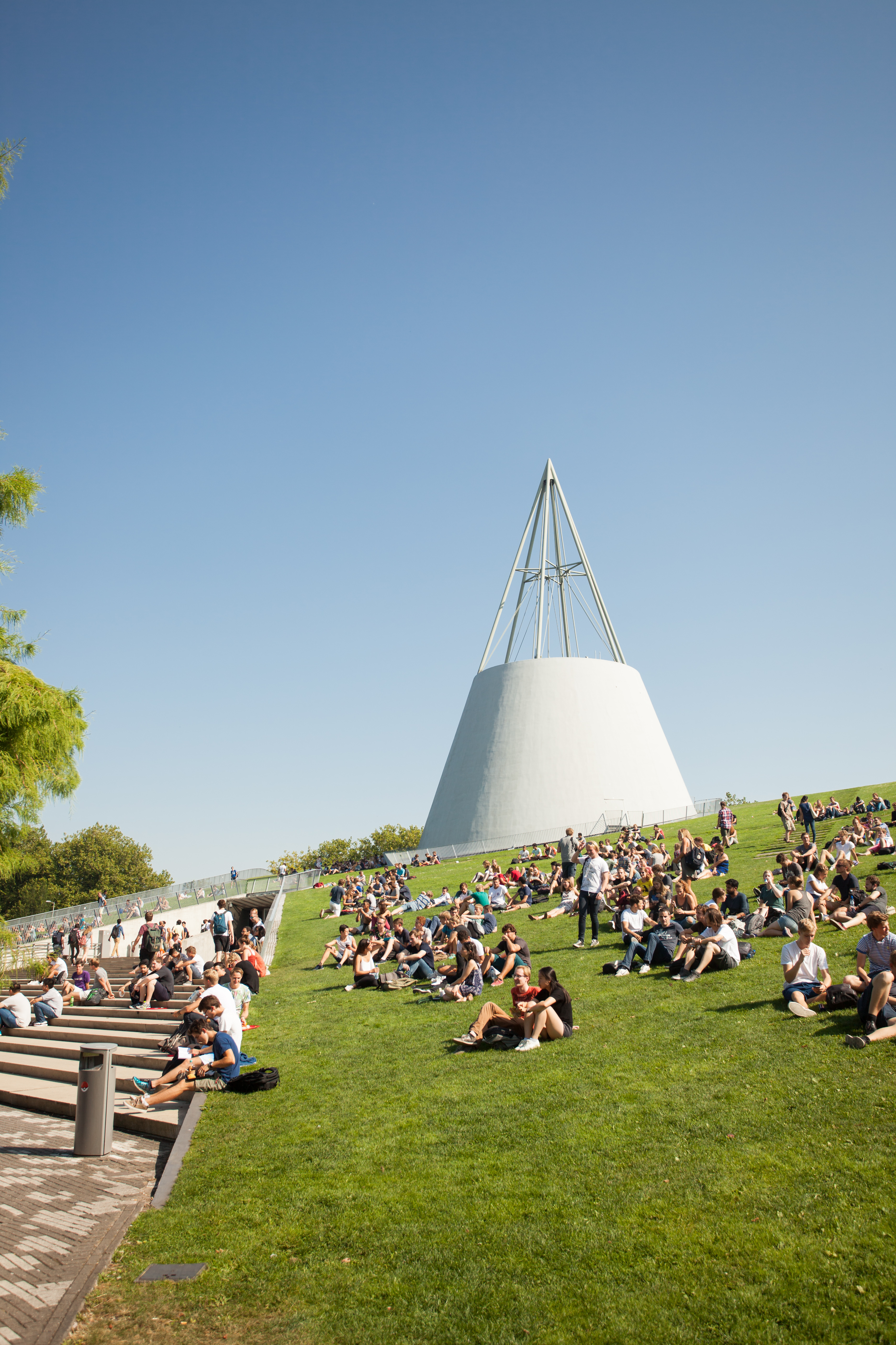
To illustrate the behaviour of images in cards, we will use two different images; one landscape, one portrait. Both are HD:

Cards are responsive; they adapt to different screens. Different users may see the website in different ways, depending on their preference, their screen resolution, and their device. A bit lower on this page, you can see some different card sizes. If they look the same to you, press Ctrl - (Ctrl minus) until you see a difference. Or you're on a tablet/phone, then this page is probably very confusing, and you should look at it on a desktop.
The different ways the image is displayed in the cards, we call 'viewports'. We selected three extreme ones to display in green in the pictures below. In the middle, you see a big cross marking the default Focal Point. This is the point the system will keep centered when cropping the image for the card. For our chosen images, these are the standard viewports:


You might get tempted to crop an image so it matches the exact dimension of the image in the card as YOU see it. But others will see a different crop... The system will lay these green viewports over your new crop - making the mobile/full width crop even narrower and with worse quality, because it will only use part of the image instead of the whole image. Only crop when your image is big enough and/or you have to hide a specific part of the image from the viewer.
A better way to focus on a specific part of the image, is to use the focal point editor. This moves the focal point from the center to where you want, and the system will try to keep that point always visible. It is not perfect, and may not work in all instances, but usually, it does the trick. This is what happens:
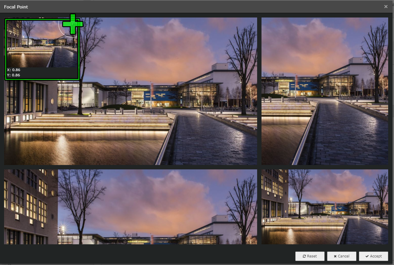
Change the focal point by clicking (not dragging!) in the top left box on the desired position, marked here by the green +

The viewports change accordingly. At the bottom of this page, you can see the result in an actual card.
Examples
Full width (also: mobile view!)
As you can see, the portrait image only shows a vey small portion of the picture. Use the focal point editor (at the added image, inside the Card element) to focus on a different part of this image.


Half width (on desktop)
The exact same cards, but in a 50% grid. The portrait image shows up better, but remember, when on mobile, you will still see the image displayed as above!
Altered focal point
When moving the focal point to the top right, this is how the image responds: