
Improved Features
Colour corrections lighter blue, light grey, medium grey
With TU Delft's online colour palette available for most elements, you can already add the necessary variation to your pages. But we did notice that a few colours simply did not 'work' online; being that they were hard to combine with other elements or that they didnt stand out as expected.
That's why we made a few adjustments to their colour codes.
The following colour codes have been altered:
- Lighter blue
- Light grey
- Medium grey
Font colour adjustment on coloured elements
Ever notice how sometimes text and links don't really display well on coloured elements such as grids, notificitions and specifically fact-elements?
Although we realize not every background colour from our palette is suitable, we did tweak a few font colours when used on a coloured background in order to improve the overall readability.
Additionally, when using the fact element, you can now pick both the fact title colour as well as the fact value colour. (Not setting this colour will automatically use the default 'white' for its font styling).
Auto-fill contact information element
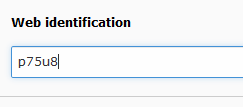
The contact information element is a nice element in itself, but a major downside was that you had to manually enter all contact information even though this information was already available at the individual staff-page.
By filling the webidentifier field with the correct code (if you don't know how to locate this code, please ask your local content manager for assistance) and saving, the page gets filled with the known information.
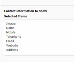
"But I don't want to display everything and/or adjust a few fields"
No problem! Any field you fill out, will overwrite the output. Also, if you want to hide a certain field, you can remove that through the multi-select box on the second tab ('advanced').

M.G. (Mitra) Smit
- +31 15 27 89248
- M.G.Smit@tudelft.nl
-
21.3.56
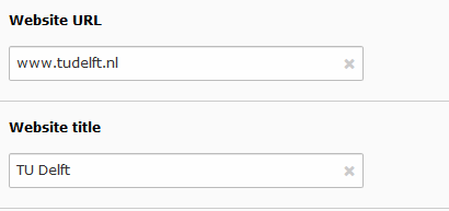
Website field added to contact information element
In addition to the previous improvement (see above) on the contact information element, we also added a website URL-field and website title-field. Filling out this field, creates a small web-icon, just below the e-mail icon, with the filled out title/url.

Style pillar items the same as cards
Pillar items can come in handy if you want to display data from another page in a card-like style, without manually creating the card. Just add the page-id and hit save will result in a working pillar item.
However, this was lacking any styling options, whereas card elements had several styling-options. So with this release we've synchronized these options. Now pillar-items can also look like regular cards, horizontal cards or even half height cards.

Append to top - styled button
TYPO3 has the option to add 'to top'-links after each selected element, as you can see in these release notes. You can add this to a grid element by editing its properties, and under the Access tab, checking the box that reads 'Append with Link to Top of Page’ .
However, we really disliked the 'to top' text and decided that a round 'arrow'-like button would suit better. Ergo, you'll no longer see the 'to top' text anymore ;-)