
New Features
Set top navigation for news & events articles
All news and event articles are kept in a dedicated part of the typo3 backend, in order to support and stimulate the sharing of articles throughout the TU Delft website without creating multiple duplicates of the same content.
However, since site-navigation is built upon the hierarchical structure within typo3, all articles shared the same top- and bottom navigation items, regardless of which faculty or department presented the article.
For example, any news article posted on the Architecture website would still show the overall TU Delft top and bottom navigation, resulting in a confusing user experience.
With this release comes the option to set a navigation starting position to create top and bottom navigation similar to the specified starting point.
Keep in mind that these settings can not be done by editors.
Please contact your local content manager for all options.
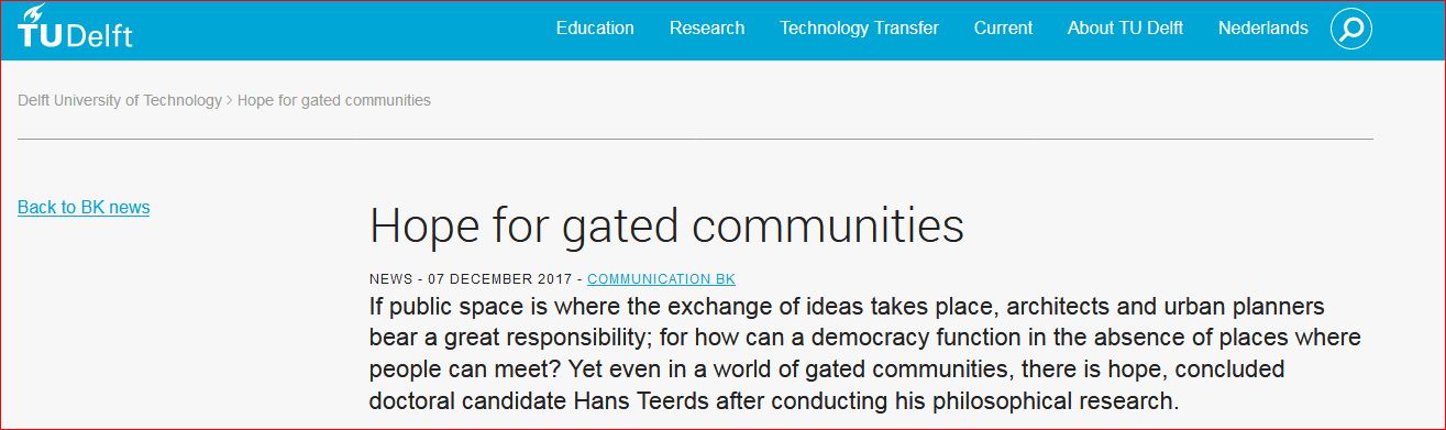
Above:
The default setting; the top (and bottom) navigation menu are based on the overarching TU Delft navigation structure, similar to www.tudelft.nl
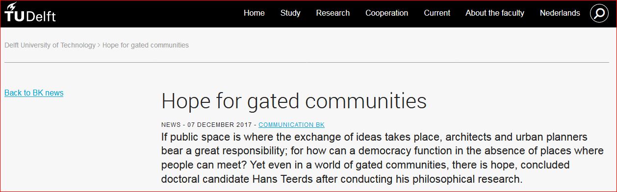
Below:
The new setting; all Architecture news articles will inherit both top navigation items as well as top navigation menu color in order to provide a more recognizable context for faculty (or departmental) news and event articles.
Dynamic content overview - Specific Card Styling
New styling features were added to the dynamic content overview plugin.
As of this release it is now also possible to specify what sort of card layout you'd like to present and what content should be shown in the cards itself.
Take a look at the new card overview options.
Because the overviews are difficult to set up properly, changes to your current template are not done by editors. Please contact your local content manager to apply for any changes.
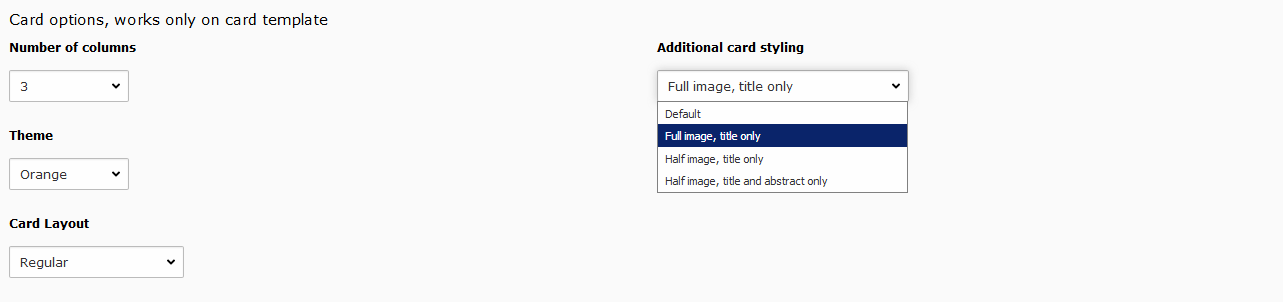
In the configuration the 'additional card styling' field has been added, providing 4 styling options:
- default
- full image - title only
- half image - title only
- half image - title and abstract only
A few examples on these options are displayed on the card overview page.
Grid visibility settings
Even though the TU Delft website is a responsive website, there will always be situations where re-arranging content is preferred for different (mobile) devices.
With grid visibility you can decide which grids, with its own content, should be visible on what devices. To view the effects, drag your browser window to a different width to simulate other devices.
You can change the visibility setting by going to your Grid Element properties, in the tab Appearance, and under Visibility, select the desired setting for that grid.
Resize your browser window for the other cards
Side navigation on mobile devices
Although not so much a new configurable feature, the following has also been added to the website:
The left navigation menu will no longer be fully displayed on mobile devices and/or smaller screens, but will start hidden behind the new 'open menu' button.
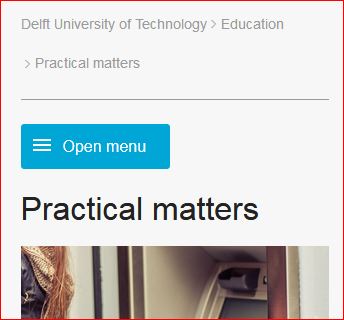
On mobile devices the left menu will be hidden behind the [open menu] button.
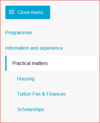
Clicking the button will expand the navigation menu. To hide it again, press [close menu].