Icons
Purpose: The TU Delft icon set was designed with the main purpose of creating a consistent visual identity within TU Delft's corporate identity and brand identity. This set was developed to serve a wide range of departments and services.
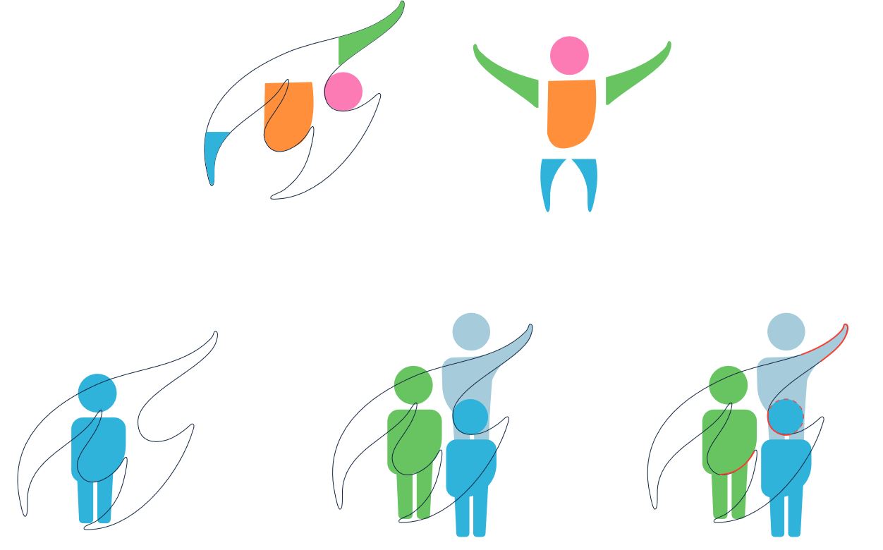
Inspiration and basis: The inspiration for the icon set comes from the flame that characterises the TU Delft logo. This flame not only symbolises innovation and progress, but also serves as a powerful connecting element within the various parts of the university. By taking the flame as the basis, a direct link is made to TU Delft's overarching identity.

Colour and house style: The colours of the icon set have been carefully chosen to fully comply with TU Delft's house style. Using the established colour palette ensures consistency. This contributes to a recognisable and coherent visual appearance.
Versatility and accessibility: The use of two file types, SVG and EPS, was strategically chosen to provide both a transparent background and optimal scalability. This allows the icons to be flexibly deployed on different platforms and in various formats.
Technical implementation: The delivery of both SVG and EPS files meets the technical needs of various applications and platforms. SVG files offer flexibility for web applications, while EPS files are suitable for print and other design applications.
The icons may not be modified or supplemented without permission from the Visual Communication department. For questions please email visualcomunication@tudelft.nl