Brand architecture
Recognisable as TU Delft through use of a single logo
A strong TU Delft brand ensures that our communication is more recognisable and has a greater impact. All departments and faculties of TU Delft contribute to this. In TU Delft’s brand architecture, we therefore work on the basis of a single TU Delft brand, leaving room in the design to name the departments and faculties.
TU Delft and all of its underlying departments use one logo. Other logos in addition to or instead of the TU Delft logo are not permitted. Exceptions apply to independent foundations and private companies in which TU Delft participates, such as FlexDelft, SAM|XL and Robovalley. The desired TU Delft brand image is shown here.
Extension to clarify sender
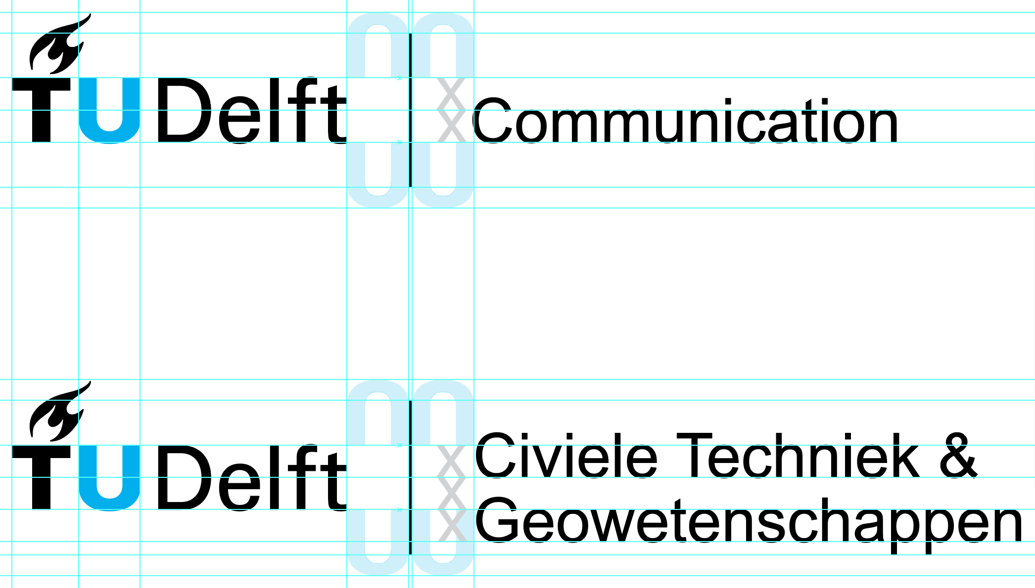
In addition to the TU Delft logo, it is possible to use an extension that is placed after the TU Delft logo. We use this if clarity is needed about the specific sender within TU Delft. The extension can be used for departments, faculties, institutes and research initiatives. The extension may never consist of abbreviations, use of double words (like Delft) and is not permitted for degree programmes, projects, labs or campaigns. How such an extension can be displayed is shown here. The preferred use is horizontal. The compact version is used if necessary for readability purposes.

Other means of differentiation
A strong TU Delft brand benefits from using its logo as consistently as possible. Recognisability for a TU Delft programme or department can also be found in other ways. For example, the use of style elements, photography or in text. On this corporate identity website, you will find all the elements of this style and various tools to help you apply these elements effectively.
For questions or advice about this, please contact the Visual Communication Team: