TU Delft Stamp
We have analysed all kinds of formats. Now it is important to determine which formats are suitable for TU Delft, and how they stand out from videos by other parties. How does it become clear that a video comes from TU Delft?
We trace the identity of TU Delft back to the brand concept and the brand flame. We can translate this into a number of creative do’s and don’ts.
Video introduction
- A video always starts with a cold open. First of all, we hear a striking quote that partly covers the content of the video, after which we see the logo animation. This first quote is short; a minimum of 5 and maximum of 20 seconds.
- The logo animation always contains the associated sound effects.
Camerawork
‘Not just any engineering, but groundbreaking engineering’. This mentality is what makes TU Delft stand out from the crowd.
Movement, pushing forwards, on and over boundaries. We translate this into the style of the camerawork:
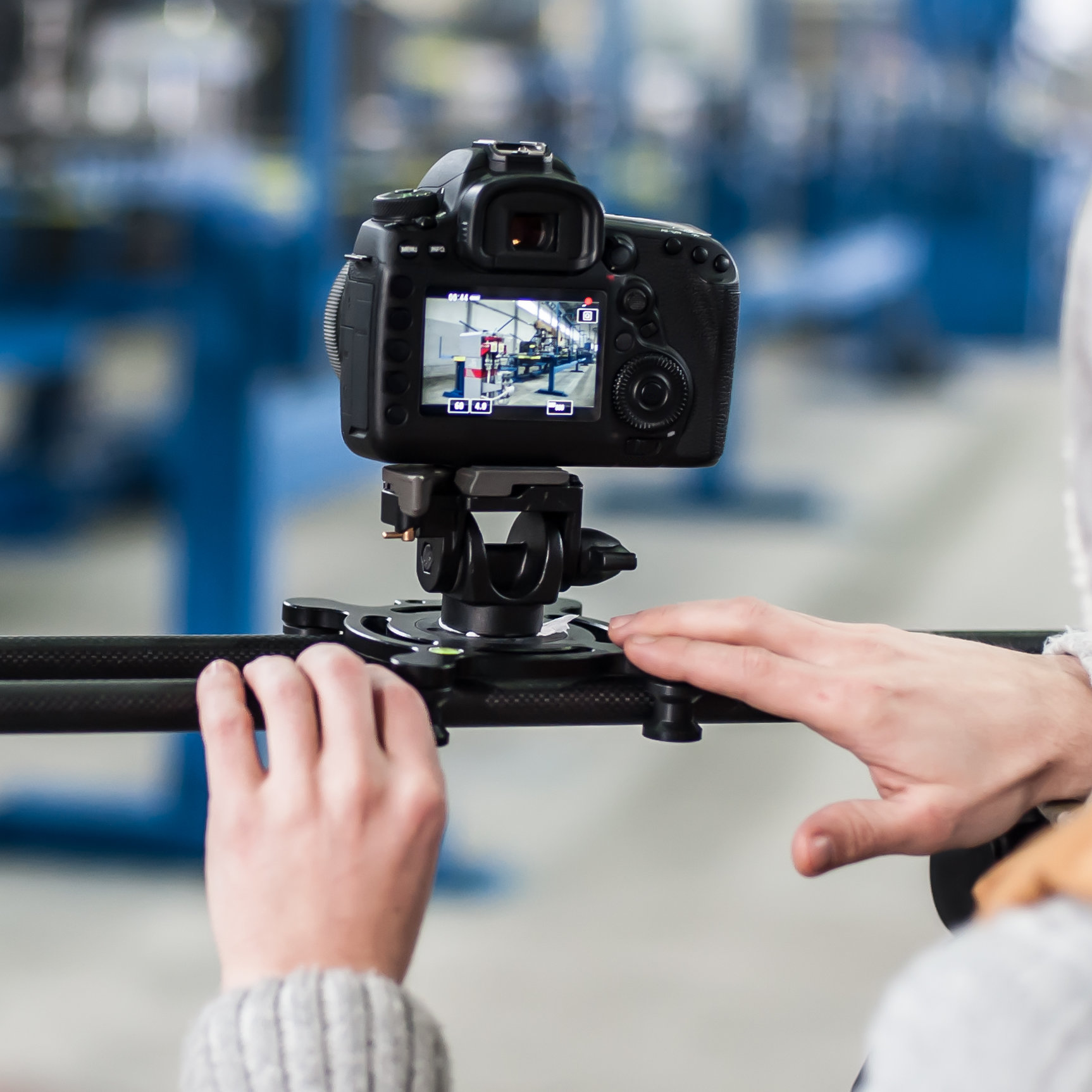
- Dynamic camerawork. We never use a tripod. Scenes are shot from the shoulder or a slider, ensuring there is always a sense of movement.
Composition
TU Delft graduate engineers are pragmatic, not engineers who endlessly discuss theories. We translate that pragmatism into focus.
- The compositions of TU Delft videos are lean and clean. By this we mean: we only show what is essential to be seen. Frames are as tight as possible. Backgrounds are of secondary importance and thus shown blurred.
- Shots are always lined up straight. Dutch angles or other framing techniques to evoke emotions are not permitted.
- Subjects should be shown in the centre of the frame.
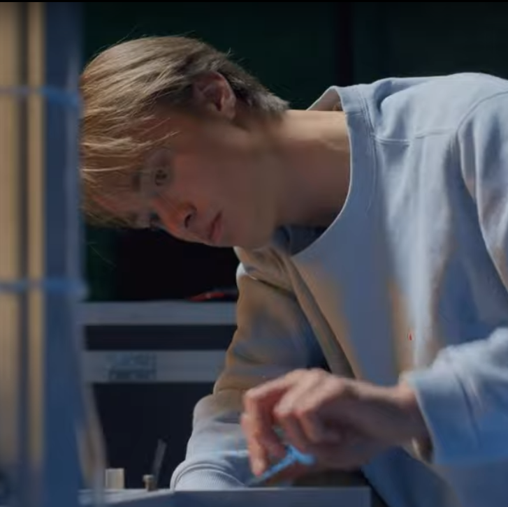
Image: Colour and contrast
Aim for functional simplicity, but the human factor, warmth and an organic sense should also play a role. This can be directly translated into use of colour and contrast:
- Colours are bright, with high contrast in the highlights and soft in the shadows.
- Use of light is bright: No one-point lighting with long shadows, but filled shadows and subtle differences between light and dark.
- For colour temperature we use light, warm tints, but we keep things looking realistic. We avoid specific tints and LUTs (pre-programmed colour arrays for film) that determine visual style.
Subject
We translate the sense of pragmatism by how we portray subjects.
- In interviews we make the least possible use of talking heads: A person sitting on a stool talking past the camera to an interviewer or telling their story. This is permitted when introducing a person, where the name bar is also shown, but after that this shot is not used, or only rarely. Instead of this we show context, more of what the person is talking about. For example, we see this person walking across the campus, studying or working on a project.

Music
Independent and unconventional are the key words that we translate into the choice of music used.
- The music stands out for its simplicity, both in rhythm and instruments. For example, genres like Deep House, Lo-Fi. Electronic instruments are predominant. Examples of suitable artists are Moderat, Kiasmos and Ry X. Of course we may not use any of their work, but good and affordable royalty-free music libraries are Artlist.io and Epidemic Sound.